class: center, middle, inverse, title-slide .title[ # Lecture 7: Base R Plots ] .author[ ### Robin Liu ] .institute[ ### UCSB ] .date[ ### 2022-06-30 ] --- # airquality We will use the `airquality` data frame in the library `datasets` ```r library(tidyverse) ``` ``` ## -- Attaching packages --------------------------------------- tidyverse 1.3.1 -- ``` ``` ## v ggplot2 3.3.6 v purrr 0.3.4 ## v tibble 3.1.7 v dplyr 1.0.9 ## v tidyr 1.2.0 v stringr 1.4.0 ## v readr 2.1.2 v forcats 0.5.1 ``` ``` ## -- Conflicts ------------------------------------------ tidyverse_conflicts() -- ## x dplyr::filter() masks stats::filter() ## x dplyr::lag() masks stats::lag() ``` ```r library(datasets) ``` --- # airquality `?airquality` will give you the metadata in the help window. Description Daily air quality measurements in New York, May to September 1973. Format A data frame with 153 observations on 6 variables. [,1] Ozone numeric Ozone (ppb) [,2] Solar.R numeric Solar R (lang) [,3] Wind numeric Wind (mph) [,4] Temp numeric Temperature (degrees F) [,5] Month numeric Month (1--12) [,6] Day numeric Day of month (1--31) --- # Base R plots Basic plotting is easy; just call the relevant functions. ```r plot(airquality$Wind, airquality$Ozone) ``` <img src="Lec7_files/figure-html/unnamed-chunk-2-1.png" width="45%" height="45%" /> -- But we should always add a meaningful title and axis labels... --- # Base R plots Basic plotting is easy; just call the relevant functions. ```r plot(airquality$Wind, airquality$Ozone, main="Ozone and Wind in NYC, 1973", xlab="Wind (mph)", ylab="Ozone (ppb)") ``` <img src="Lec7_files/figure-html/unnamed-chunk-3-1.png" width="50%" height="50%" /> --- # Adding a trendline ```r plot(airquality$Wind, airquality$Ozone, main="Ozone and Wind in NYC, 1973", xlab="Wind (mph)", ylab="Ozone (ppb)") air_trend <- lm(airquality$Ozone ~ airquality$Wind) abline(air_trend, col = "red") ``` <img src="Lec7_files/figure-html/unnamed-chunk-4-1.png" width="50%" height="50%" /> --- # Your turn Create a scatter plot of Ozone vs. Solar Radiation with a trendline. Add a meaningful title and axis labels to the plot. 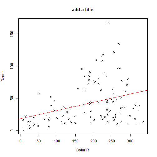<!-- --> <div class="countdown" id="timer_62bdd93f" style="right:0;bottom:0;" data-warnwhen="0"> <code class="countdown-time"><span class="countdown-digits minutes">02</span><span class="countdown-digits colon">:</span><span class="countdown-digits seconds">00</span></code> </div> --- # Histograms .pull-left[ ```r hist(airquality$Ozone, main = "Histogram of Ozone", xlab = "Ozone") ``` 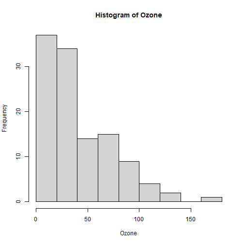<!-- --> ] -- .pull-right[ ```r hist(airquality$Ozone, breaks = 20, main = "Histogram of Ozone", xlab = "Ozone") ``` 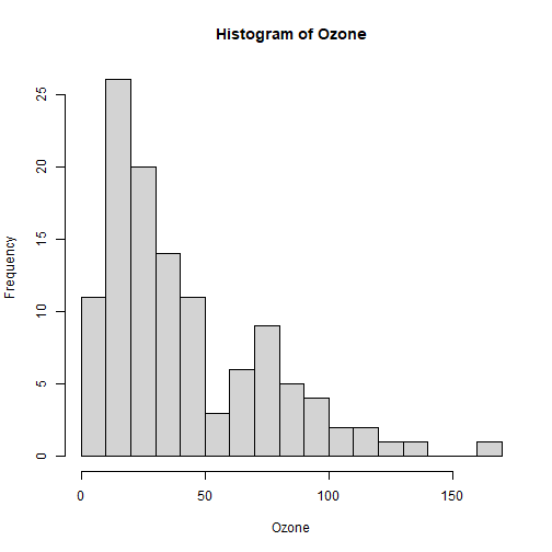<!-- --> ] --- # Boxplots Boxplots use the `y ~ x` notation. In R, this construct is called a `formula` ```r boxplot(Ozone ~ Month, airquality, xlab = "Month", ylab = "Ozone (ppb)") ``` <img src="Lec7_files/figure-html/unnamed-chunk-8-1.png" width="45%" height="45%" /> Median, percentiles, quartiles, IQR, outliers --- # Formulas ```r boxplot(Ozone ~ Month, airquality, xlab = "Month", ylab = "Ozone (ppb)") ``` <img src="Lec7_files/figure-html/unnamed-chunk-9-1.png" width="45%" height="45%" /> ```r class(y ~ x) ``` ``` ## [1] "formula" ``` --- # Building plots It is common to first create a plot and then layer stuff on top. ```r x <- 1:3 y <- c(1, 3, 8) plot(x, y) # Creates a new plot lmout <- lm(y ~ x) abline(lmout) # adds a line "fitting" the points ``` .pull-left[ <img src="Lec7_files/figure-html/unnamed-chunk-11-1.png" width="85%" height="80%" /> ] .pull-right[ <img src="Lec7_files/figure-html/unnamed-chunk-12-1.png" width="85%" height="80%" /> ] --- # Plot parameters ```r x <- 1:3 y <- c(1, 3, 8) plot(x, y, cex=2, col="red", pch=19) # Creates a new plot lmout <- lm(y ~ x) abline(lmout, lty=2, lwd=2) # adds a line "fitting" the points ``` .pull-left[ <img src="Lec7_files/figure-html/unnamed-chunk-14-1.png" width="85%" height="80%" /> ] .pull-right[ <img src="Lec7_files/figure-html/unnamed-chunk-15-1.png" width="85%" height="80%" /> ] --- # Plot parameters Plotting is an art and you should use Google and `?par` to get a plot to look nice. ```r x <- 1:3 y <- c(1, 3, 8) plot(x, y, cex=3, col="chartreuse4", pch=17) # Creates a new plot lmout <- lm(y ~ x) abline(lmout, lty=2, lwd=2) # adds a line "fitting" the points ``` .pull-left[ <img src="Lec7_files/figure-html/unnamed-chunk-17-1.png" width="85%" height="80%" /> ] .pull-right[ 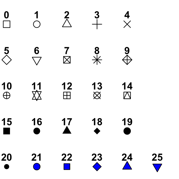 ] --- # Plot parameters Plotting is an art and you should use Google and `?par` to get a plot to look nice. ```r x <- 1:3 y <- c(1, 3, 8) plot(x, y, cex=3, col="chartreuse4", pch=17) # Creates a new plot lmout <- lm(y ~ x) abline(lmout, lty=2, lwd=2) # adds a line "fitting" the points ``` .pull-left[ <img src="Lec7_files/figure-html/unnamed-chunk-19-1.png" width="85%" height="80%" /> ] .pull-right[ 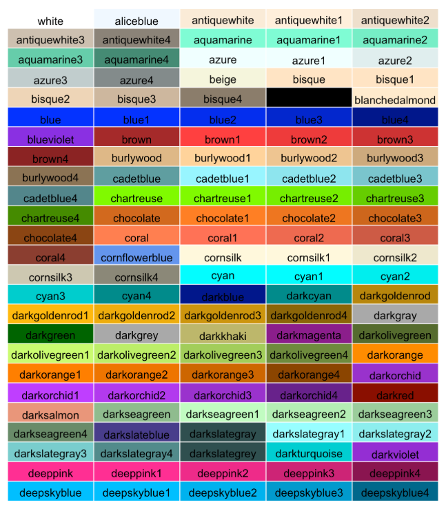 ] --- # Building plots We see a negative trend with wind and ozone. .pull-left[ ```r plot(airquality$Wind, airquality$Ozone) ``` 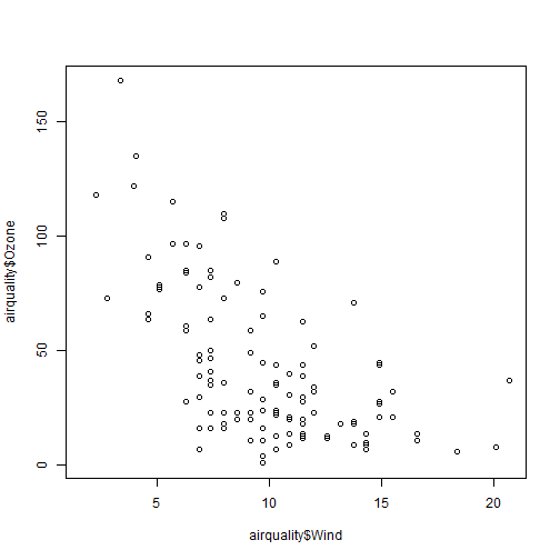<!-- --> ] -- .pull-right[ A flat screen can only show two variables. unless...? 😳 We can add another dimension of information by employing *shape* and *color*. ] --- # Layering Plots Demo 1 It is common for complex plots to start with an *empty* plot and layer stuff on top. <img src="Lec7_files/figure-html/unnamed-chunk-21-1.png" style="display: block; margin: auto;" /> --- # Layering Plots Demo 1 ```r with(airquality, plot(Wind, Ozone, main = "Ozone and Wind in New York City", type = "n")) with(filter(airquality, Month != 5), points(Wind, Ozone, col="red", pch=19)) with(filter(airquality, Month == 5), points(Wind, Ozone, col="blue", pch=17)) legend("topright", pch = c(17, 19), col = c("blue", "red"), legend = c("May", "Other Months")) ``` 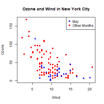<!-- --> --- # Layering Plots Demo 2 How does *temperature* relate to ozone and wind? 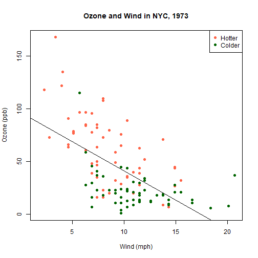<!-- --> --- # Plotting functions To plot a function, *discretize* the domain into `x` and *evaluate* the function into `y`. ```r x <- seq(-2*pi, 2*pi, len = 100) y <- sin(x) plot(y ~ x) ``` <img src="Lec7_files/figure-html/unnamed-chunk-24-1.png" width="50%" height="50%" /> --- # Plotting functions To plot a function, *discretize* the domain into `x` and *evaluate* the function into `y`. ```r x <- seq(-2*pi, 2*pi, len = 100) y <- sin(x) plot(y ~ x, type="l") # type="1" smooths the line ``` <img src="Lec7_files/figure-html/unnamed-chunk-25-1.png" width="50%" height="50%" /> --- # Plotting functions To plot a function, *discretize* the domain into `x` and *evaluate* the function into `y`. ```r x <- seq(-2*pi, 2*pi, len = 100) y <- sin(x) plot(y ~ x, type="l") # type="1" smooths the line lines(cos(x) ~ x, type="l", col="blue") # "lines" adds to an existing plot ``` <img src="Lec7_files/figure-html/unnamed-chunk-26-1.png" width="50%" height="50%" /> --- # Plotting functions ```r x <- seq(-2*pi, 2*pi, len = 100) y <- sin(x) plot(y ~ x, type="l") # type="1" smooths the line lines(cos(x) ~ x, type="l", col="blue") # "lines" adds to an existing plot legend("topright", lty = 1, col = c("black", "blue"), legend = c("sin(x)", "cos(x)")) ``` <img src="Lec7_files/figure-html/unnamed-chunk-27-1.png" width="50%" height="50%" /> --- # Your turn *Hint*: Use `type`, `lty`, `lwd`, and `col` parameters. Remember to check out `?par`. 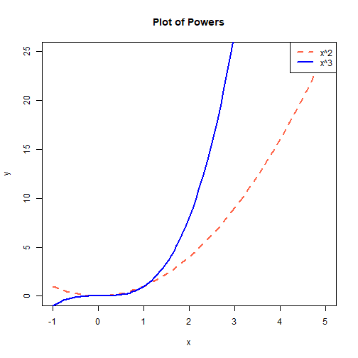<!-- --> <div class="countdown" id="timer_62bdd803" style="right:0;bottom:0;" data-warnwhen="0"> <code class="countdown-time"><span class="countdown-digits minutes">06</span><span class="countdown-digits colon">:</span><span class="countdown-digits seconds">00</span></code> </div>