class: center, middle, inverse, title-slide .title[ # Lecture 16: Data Visualization ] .author[ ### Robin Liu ] .institute[ ### UCSB ] .date[ ### 2022-07-19 ] --- class: inverse, middle, center # Data Visualization --- # Data Visualization Remember the *datasaurus dozen*. Numerical summaries are not enough. .center[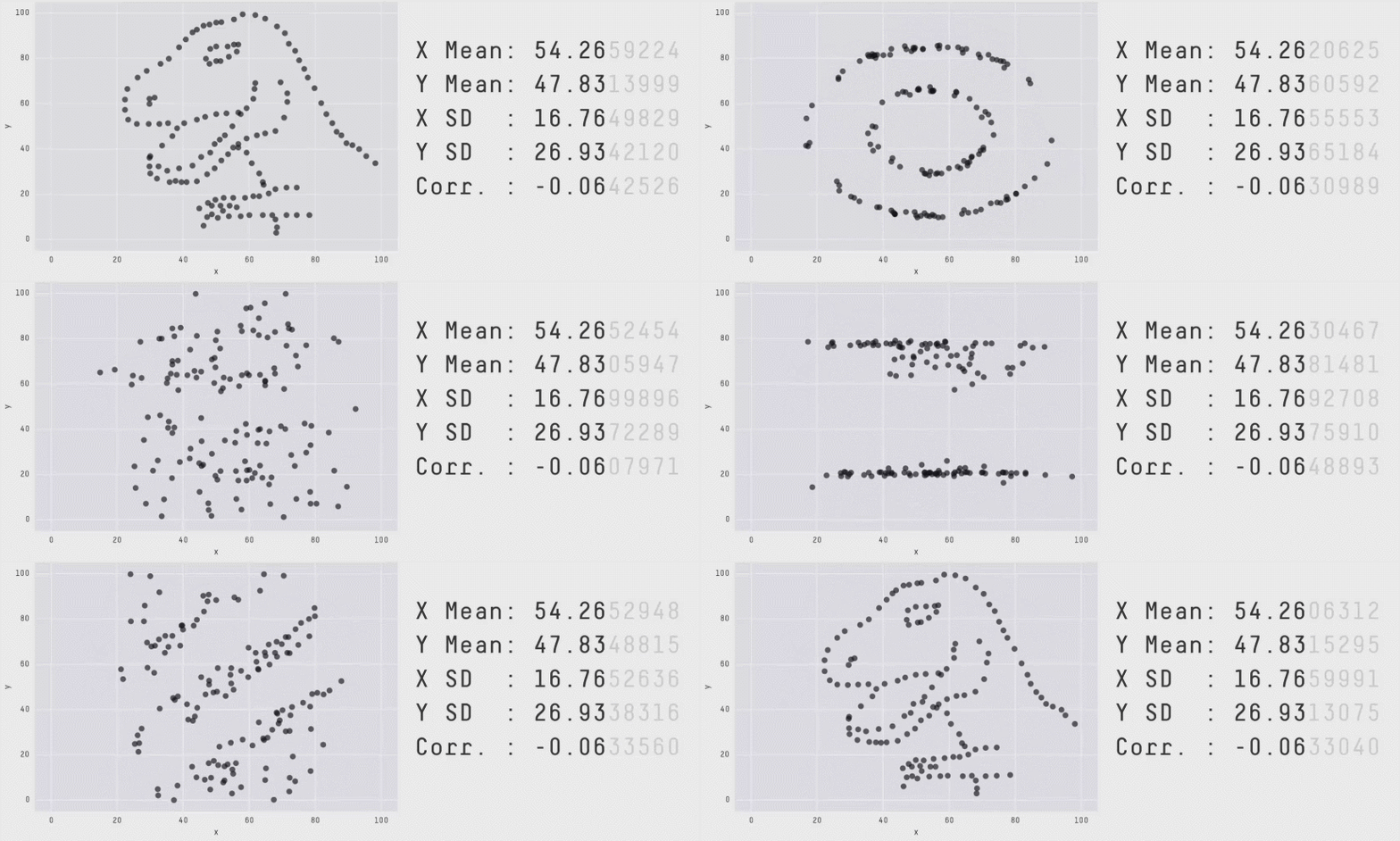] --- # Data Visualization A plot from [Jackman (1980)](https://www.jstor.org/stable/2095134), a comment on [Hewitt (1977)](https://www.jstor.org/stable/2094750). .pull-left[ .center[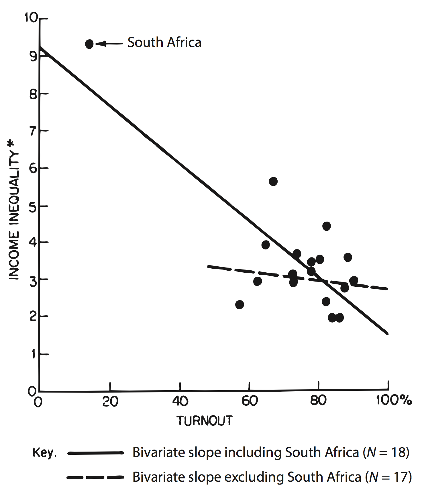] ] -- .pull-right[ Original claim: strong association between voter turnout and income inequality. Simple scatter plot shows South Africa has *high leverage*. ] --- # Mapping aesthetics We have some data in a data frame. To plot it, we map visual elements (aesthetics) of the plot to variables in the data frame. The `ggplot2` library, part of the `tidyverse`, is based on this idea. -- Data visualization is an art. There are no strict guidelines on effective visualization. --- # Mapping aesthetics A figure with perceptual problems and excessive aesthetic mappings. .center[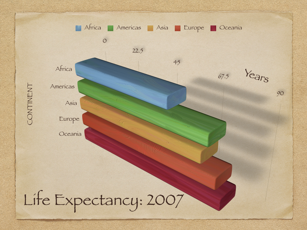] --- # Mapping aesthetics Poor choice of visual elements in a plot. .center[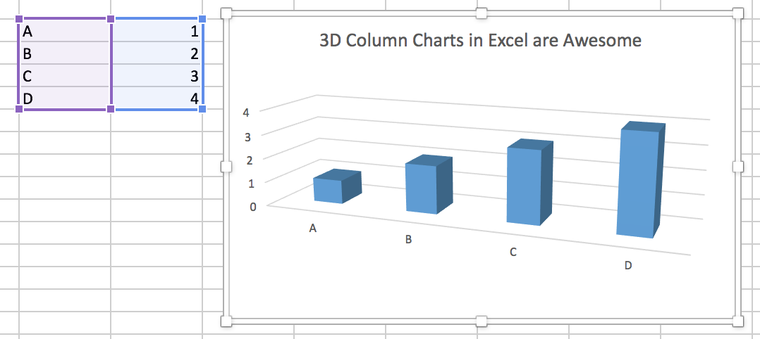] -- .center[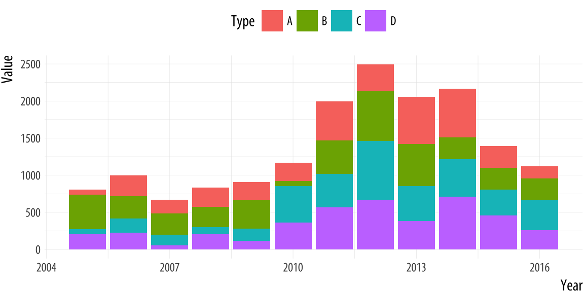] -- Values are mapped to the length of bars, but visual choices make comparisons difficult. --- # Mapping aesthetics ### "The best statistical graphic ever drawn" .center[[](https://socviz.co/assets/ch-01-minard.png)] [Minard: Napoleon's retreat from Moscow](https://sciencenorway.no/blog-blog-from-numbers-to-graphics-statistics/charles-joseph-minards-map-of-napoleons-flawed-russian-campaign-an-ever-current-classic/1618695) Many variables are displayed: position and size of army, time advancing and retreating, temperature during retreat. --- # Mapping aesthetics We have some data in a data frame. To plot it, we map visual elements (aesthetics) of the plot to variables in the data frame. The `ggplot2` library, part of the `tidyverse`, is based on this idea. -- Before introducing `ggplot2`, we look at some examples of plots and their data. --- # Plot examples .center[[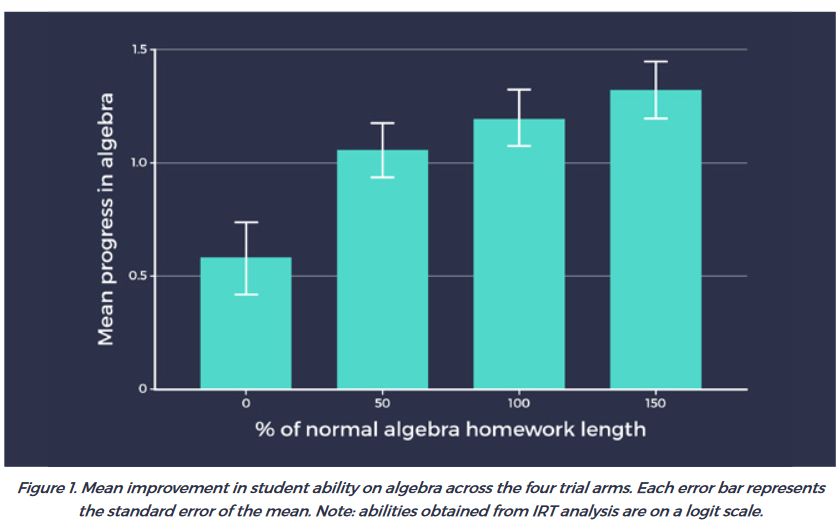](https://astralcodexten.substack.com/p/nobody-knows-how-well-homework-works)] -- .pull-left[ ``` ## # A tibble: 4 x 2 ## alg_prog hw_length ## <dbl> <fct> ## 1 0.6 0 ## 2 1.1 50 ## 3 1.25 100 ## 4 1.3 150 ``` ] -- .pull-right[ **Bar chart** - x-axis *mapped* to `hw_length` - y-axis *mapped* to `alg_prog` ] --- # Plot examples .center[[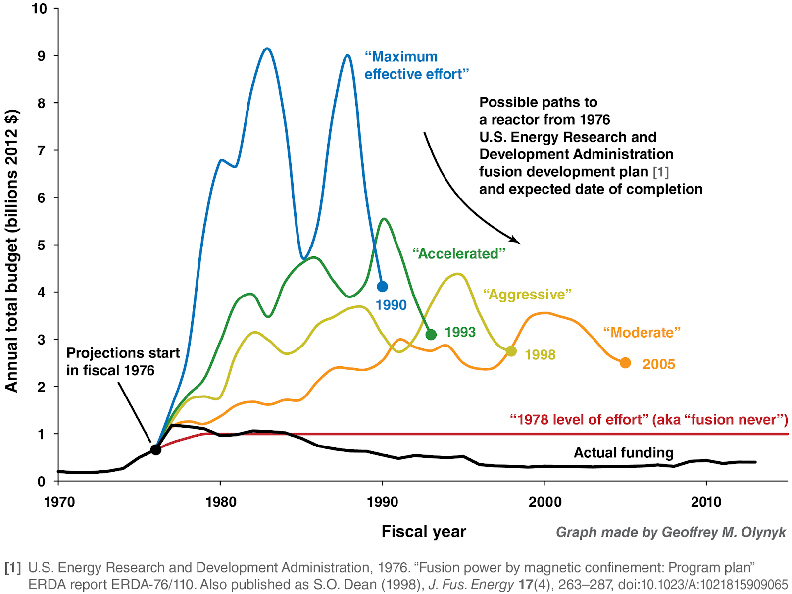](https://astralcodexten.substack.com/p/your-book-review-the-future-of-fusion)] -- .pull-left[ ``` ## # A tibble: 5 x 3 ## year budget funding_plan ## <dbl> <dbl> <fct> ## 1 1976 0.7 A ## 2 1976 0.7 B ## 3 1976 0.7 C ## 4 1976 0.7 D ## 5 1977 1 A ``` ] -- .pull-right[ **Line Plot** - x-axis *mapped* to `year` - y-axis *mapped* to `budget` - color *mapped* to `funding_plan` ] --- # Plot examples [Employee Donation](https://substackcdn.com/image/fetch/f_auto,q_auto:good,fl_progressive:steep/https%3A%2F%2Fbucketeer-e05bbc84-baa3-437e-9518-adb32be77984.s3.amazonaws.com%2Fpublic%2Fimages%2F416ec862-3759-4e54-87bf-67158501ad96_1710x1562.jpeg) .center[ 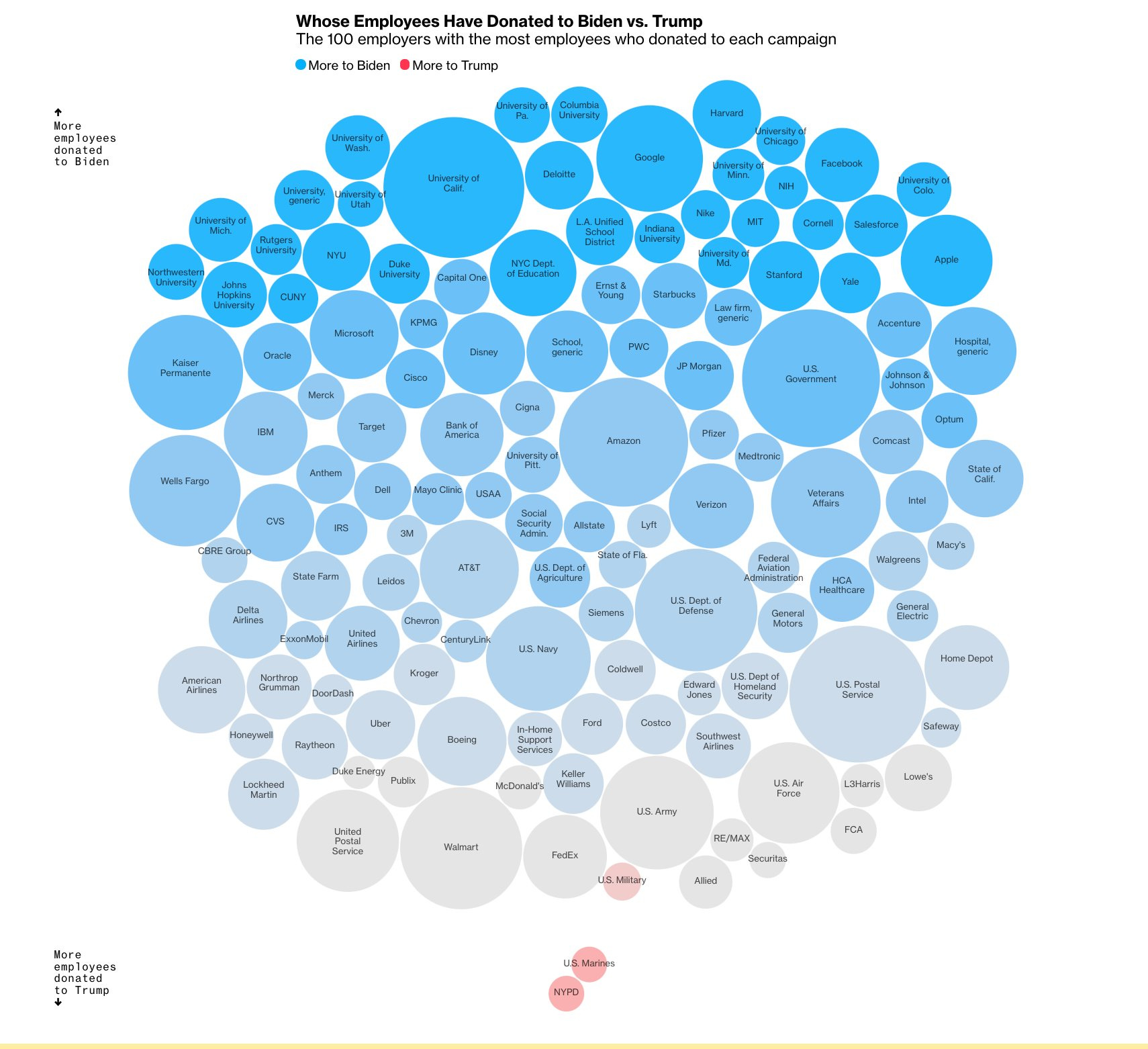 ] .pull-left[ ``` ## # A tibble: 2 x 3 ## employer employee_count biden_pct ## <chr> <dbl> <dbl> ## 1 Google 135 95 ## 2 Harvard 13 98 ``` ] -- .pull-right[ ** Bubble plot ** - y-axis *mapped* to `biden_pct` - color *mapped* to `biden_pct` - size *mapped* to `employee_count` ] --- class: inverse, middle, center # Introducing ggplot --- # ggplot ggplot examples - [R Graph Gallery](https://r-graph-gallery.com/ggplot2-package.html) Resources: - [Healy - Data Visualization](https://socviz.co/) - [Wickam - ggplot2](https://ggplot2-book.org/index.html) - [Wickam - R for Data Science](https://r4ds.had.co.nz/index.html) --- # Base R vs ggplot ## Redoing the life expectancy plot .pull-left[] .pull-right[ ```r # library(gapminder) (gap_avglife <- gapminder |> filter(year == 2007) |> group_by(continent) |> summarize(avgLifeExp = mean(lifeExp))) ``` ``` ## # A tibble: 5 x 2 ## continent avgLifeExp ## <fct> <dbl> ## 1 Africa 54.8 ## 2 Americas 73.6 ## 3 Asia 70.7 ## 4 Europe 77.6 ## 5 Oceania 80.7 ``` ] --- # group_by and summarize ```r gapminder |> filter(year == 2007) |> # For all observations in 2007, group_by(continent) |> # for each continent... summarize(avgLifeExp = mean(lifeExp)) # get the mean life expectancy. ``` ``` ## # A tibble: 5 x 2 ## continent avgLifeExp ## <fct> <dbl> ## 1 Africa 54.8 ## 2 Americas 73.6 ## 3 Asia 70.7 ## 4 Europe 77.6 ## 5 Oceania 80.7 ``` --- # Base R vs ggplot ```r par(mar = c(5,8,3,3)) barplot(gap_avglife$avgLifeExp, horiz = T, names.arg = c("Africa", "Americas", "Asia", "Europe", "Oceania"), las = "1", main = "Average Life Expectancy (2007)", xlab = "Years", ylab = "Continent") ``` <img src="Lec16_files/figure-html/unnamed-chunk-7-1.png" style="display: block; margin: auto;" /> -- `horiz`? `las`? `names.arg`? `mar`? 🤔 The creation process involved seemingly random parameters. It is missing a *grammar*. --- # Base R vs ggplot ```r # library(ggplot2) p <- ggplot(gap_avglife, mapping = aes(x = avgLifeExp, y = continent, fill = continent)) p + geom_col() + guides(fill = "none") + labs(x = "Years", y = "Continent", title = "Average Life Expectancy (2007)", caption = "Source: Gapminder.") + theme_bw() ``` <img src="Lec16_files/figure-html/unnamed-chunk-8-1.png" style="display: block; margin: auto;" /> --- # ggplot ```r p <- ggplot(gap_avglife, mapping = aes(x = avgLifeExp, y = continent)) p ``` <img src="Lec16_files/figure-html/unnamed-chunk-9-1.png" style="display: block; margin: auto;" /> `mapping = aes(x = avgLifeExp, y = continent)` This defines an **aesthetic mapping** from the data to the visual elements. The axes reflect this mapping. The specific visual elements are not decided yet; nothing is plotted. --- # ggplot ```r p <- ggplot(gap_avglife, mapping = aes(x = avgLifeExp, y = continent)) * p + geom_col() ``` <img src="Lec16_files/figure-html/unnamed-chunk-10-1.png" style="display: block; margin: auto;" /> We added a **geometric layer** that uses the aesthetic mapping. `geom_col()` displays the `x` aesthetic as lengths of a bar and the `y` aesthetic as the category. --- # ggplot ```r p <- ggplot(gap_avglife, mapping = aes(x = avgLifeExp, y = continent)) * p + geom_point() ``` <img src="Lec16_files/figure-html/unnamed-chunk-11-1.png" style="display: block; margin: auto;" /> We used a different geometric layer. `geom_point()` displays the `x` and `y` aesthetics as positions of points. Note that we used the same mapping! This is called a *Cleveland dot plot*. --- # ggplot ```r p <- ggplot(gap_avglife, mapping = aes(x = avgLifeExp, y = continent, color = continent)) p + geom_col() ``` <img src="Lec16_files/figure-html/unnamed-chunk-12-1.png" style="display: block; margin: auto;" /> Adding a new aesthetic mapping. Attempt to color in each bar. --- # ggplot ```r p <- ggplot(gap_avglife, mapping = aes(x = avgLifeExp, y = continent, fill = continent)) p + geom_col() ``` <img src="Lec16_files/figure-html/unnamed-chunk-13-1.png" style="display: block; margin: auto;" /> Adding a new aesthetic mapping, the continent factor now maps to fill color. `geom_col` automatically knows how to deal with this mapping. --- # ggplot ```r p <- ggplot(gap_avglife, mapping = aes(x = avgLifeExp, y = continent, fill = continent)) p + geom_col() + * guides(fill = "none") ``` <img src="Lec16_files/figure-html/unnamed-chunk-14-1.png" style="display: block; margin: auto;" /> Every aesthetic mapping has a *guide*. Here we set the fill guide to "none", which removes the legend, since it is redundant. --- # ggplot ```r p <- ggplot(gap_avglife, mapping = aes(x = avgLifeExp, y = continent, fill = continent)) p + geom_col() + guides(fill = "none") + labs(x = "Years", y = "Continent", title = "Average Life Expectancy (2007)", caption = "Source: Gapminder.") ``` <img src="Lec16_files/figure-html/unnamed-chunk-15-1.png" style="display: block; margin: auto;" /> Adjust title and labels with `labs`. --- # ggplot ```r p <- ggplot(gap_avglife, mapping = aes(x = avgLifeExp, y = continent, fill = continent)) p + geom_col() + guides(fill = "none") + labs(x = "Years", y = "Continent", title = "Average Life Expectancy (2007)", caption = "Source: Gapminder.") + * theme_bw() ``` <img src="Lec16_files/figure-html/unnamed-chunk-16-1.png" style="display: block; margin: auto;" /> Plot can be customized through [many themes](https://r-charts.com/ggplot2/themes/). --- # ggplot In week 2 we created this base R plot using `gapminder` data. Let's recreate this plot in `ggplot`. ```r plot(lifeExp ~ log(gdpPercap, base = 10), gapminder, main = "Life Expectancy and GDP on log scale") with(gapminder, abline(lm(lifeExp ~ log(gdpPercap, base = 10)), col = "red", lwd = 2)) ``` <img src="Lec16_files/figure-html/unnamed-chunk-17-1.png" style="display: block; margin: auto;" /> --- # ggplot <img src="Lec16_files/figure-html/unnamed-chunk-18-1.png" style="display: block; margin: auto;" /> --- # The Layered Grammar of Graphics .center[] There is a learning curve with `ggplot`, but all `ggplot` figures follow the same *grammar*. Compare to base R where there are specific parameters for specific functions. --- # A boxplot Create the following plot with `ggplot`. You may have to Google (or guess) what the right geometric layer is. <img src="Lec16_files/figure-html/unnamed-chunk-19-1.png" style="display: block; margin: auto;" /> <div class="countdown" id="timer_62d6d4b4" style="right:0;bottom:0;" data-warnwhen="0"> <code class="countdown-time"><span class="countdown-digits minutes">05</span><span class="countdown-digits colon">:</span><span class="countdown-digits seconds">00</span></code> </div> --- class: inverse, center, middle # Mapping vs Setting Aesthetics --- # Mapping vs Setting Aesthetics The x and y positions are mapped to `gdpPercap` and `lifeExp`. ```r p <- ggplot(gapminder, mapping = aes(x = gdpPercap, y = lifeExp)) p + geom_point() + scale_x_log10(labels = scales::label_dollar()) ``` <img src="Lec16_files/figure-html/unnamed-chunk-20-1.png" style="display: block; margin: auto;" /> --- # Mapping vs Setting Aesthetics We can map additional variables to aspects of a scatterplot. For example, we can map the `color` aesthetic to the `continent` variable. ```r p <- ggplot(gapminder, mapping = aes(x = gdpPercap, y = lifeExp, color = continent)) p + geom_point() + scale_x_log10(labels = scales::label_dollar()) ``` <img src="Lec16_files/figure-html/unnamed-chunk-21-1.png" style="display: block; margin: auto;" /> -- Note a *guide* was automatically added for this aesthetic. --- # Mapping vs Setting Aesthetics ```r p <- ggplot(gapminder, mapping = aes(x = gdpPercap, y = lifeExp, color = "purple")) p + geom_point() + scale_x_log10(labels = scales::label_dollar()) ``` <img src="Lec16_files/figure-html/unnamed-chunk-22-1.png" style="display: block; margin: auto;" /> What happened? --- # Mapping vs Setting Aesthetics Only *mappings* should go in the `aes()` function. Our tibble does not contain a variable called "purple". -- Behind the scenes, `ggplot` created a new categorical variable with "purple" for every row. ``` ## # A tibble: 5 x 7 ## country continent year lifeExp pop gdpPercap new_var ## <fct> <fct> <int> <dbl> <int> <dbl> <chr> ## 1 Afghanistan Asia 1952 28.8 8425333 779. purple ## 2 Afghanistan Asia 1957 30.3 9240934 821. purple ## 3 Afghanistan Asia 1962 32.0 10267083 853. purple ## 4 Afghanistan Asia 1967 34.0 11537966 836. purple ## 5 Afghanistan Asia 1972 36.1 13079460 740. purple ``` Hence every row with value "purple" is mapped to the same color, which by default is `#F8766D` -- In short: `aes()` is for **mappings only**. --- # Mapping vs Setting Aesthetics Setting an attribute outside of `aes()` does what we want. ```r p <- ggplot(gapminder, mapping = aes(x = gdpPercap, y = lifeExp)) p + geom_point(color = "purple") + scale_x_log10(labels = scales::label_dollar()) ``` <img src="Lec16_files/figure-html/unnamed-chunk-24-1.png" style="display: block; margin: auto;" /> --- # Mapping vs Setting Aesthetics This can be quite useful. ```r p <- ggplot(gapminder, mapping = aes(x = gdpPercap, y = lifeExp)) p + geom_point(alpha = 0.3) + scale_x_log10(labels = scales::label_dollar()) ``` <img src="Lec16_files/figure-html/unnamed-chunk-25-1.png" style="display: block; margin: auto;" /> --- # A Polished Plot <img src="Lec16_files/figure-html/unnamed-chunk-26-1.png" style="display: block; margin: auto;" /> --- # Themes Many themes are available to make your plots look professional. Our class will be using default themes: https://ggplot2.tidyverse.org/reference/ggtheme.html But know that very fancy themes exist in the `ggthemes` package. https://yutannihilation.github.io/allYourFigureAreBelongToUs/ggthemes/ --- # Remark By the end of the class you will be able to identify many `ggplot`s in the wild. *Exercise:* In the PSTAT hallway in South Hall, there are several posters displaying professors' research. Identify the figures that were made with `ggplot`.